
Brand
Guidelines

Bracco Copyright © 2025 | Registered office: Via E. Folli, 50, 20134 Milano, Italy | Share Capital € 104.000.000 f.p. | VAT Milan Comp. Reg. n. 00825120157 | Milan REA n. 348182

Asset-3
Asset-2


Bracco Brand

Heritage

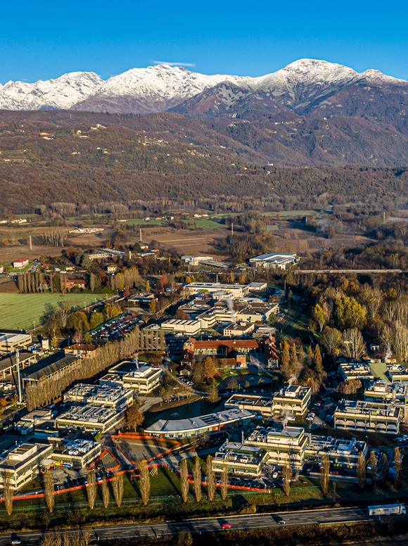
Bracco was founded in 1927 and today is one of the global leader in diagnostic imaging.

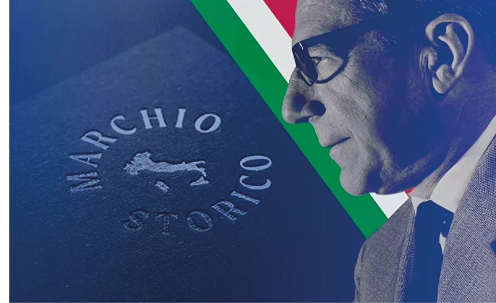
Since 2020 Bracco is a Historical Trademark of National Interest present in the Special Register at the Italian Patent and Trademark established in the same year by the Ministry of Economic Development.

The «Historical Trademark of National Interest» logo is given exclusively to trademarks of registered companies, continuously renewed for at least 50 years and used for the marketing of products of excellence, historically linked to the Italian territory.

“A company’s brand provides an internationally competitive edge. Indeed, the logo is full of company history and values, and conveys emotions. In the pharmaceutical chemicals and imaging industry, the Bracco logo stands for responsibility, reliability, seriousness and effectiveness. In other words, it is an assurance of quality for doctors, patients, institutions, suppliers, and for the employees themselves who feel a strong sense of belonging at all corporate offices around the world.”

Diana Bracco

The Bracco Group logo also has a story behind it that deserves to be told: the hexagon was personally designed by Fulvio Bracco in the 1970s. The captain of industry was inspired by the benzene ring at the center of the Iopamidol chemical structure, the result of Bracco’s in-house research, which revolutionized diagnostic imaging worldwide and is still the gold standard today.

The Bracco Historical Archive is aimed at emphasizing, promoting and enhancing our brand and its heritage.

A website is entirely dedicated to the #braccostories enhances historical documents, houseorgan, photographs, videos and unpublished audio. In addition, a podcast section tells stories of family, business, innovation, sustainability and culture.

Purpose

Our Purpose and Mission sums up the fundamental principles that guide the company’s branding strategy. It provides a foundation for brand consistency, enabling the company to establish a recognizable and trustworthy presence in the marketplace.

Improving people’s lives by shaping the future of prevention and precision imaging.

Mission

Bracco is focused on the development, manufacture, and marketing of contrast agents, medical devices, and more advanced solutions to improve the diagnostic imaging journey of professionals and the public.

Taking pride in our commitment to patients, history of innovation, team talent and sustainable approach.

Values

The Bracco Values communication campaign has resonated globally across our Group, having been translated into over 10 languages within 12 months. This initiative has distilled the essence of being Bracco People into 5 key words: Passion, Continuous Evolution, Sustainability, Extraordinary, and People.

A series of icons to convey our principles and our values.

Payoff

Corporate

The Claim that encapsulates who we are, what we are about, and why people should choose Bracco is “Life from Inside“, and it is the only claim allowed to represent Bracco Corporate Communication. This claim cannot be used alone; it must always be associated with the logo.

Claim

Bracco Imaging

Bracco Imaging’s tagline “Unlocking the Invisible” is an inspiring and powerful message which speaks to the company’s commitment to unlocking the secrets of medical imaging and advancing the field in order to improve patient care. It is a call to action for radiologists and the imaging industry to come together to explore the potential of medical imaging, revolutionizing the way we diagnose and treat diseases. By bringing Bracco as a company closer to its community of radiologists, this tagline creates an emotional connection between Bracco and its customers and helps to strengthen the bond between the company and the industry. This tagline encourages radiologists and imaging professionals to explore the miracles of medical imaging and to discover new possibilities for patient care. This claim is authorised to represent Bracco Imaging Communication.


Brand Personality

Brand Identity

Archetype

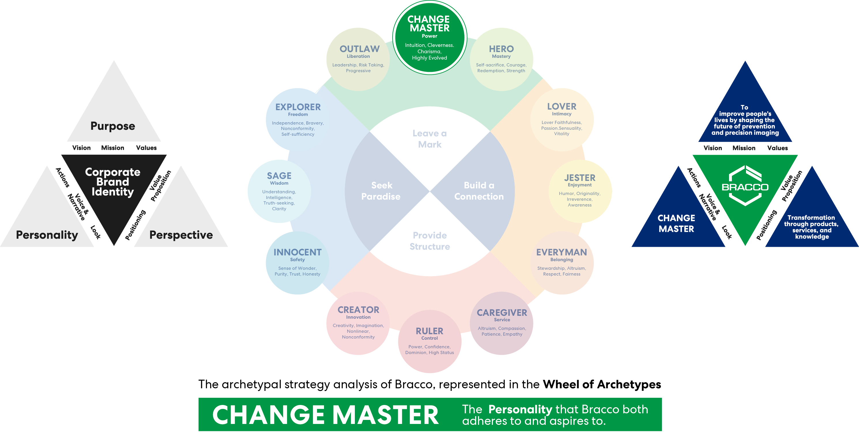
To build a strong and valuable brand personality, the brand archetype comes into play. This is a representation of the brand personality based on 12 key human desires and values.

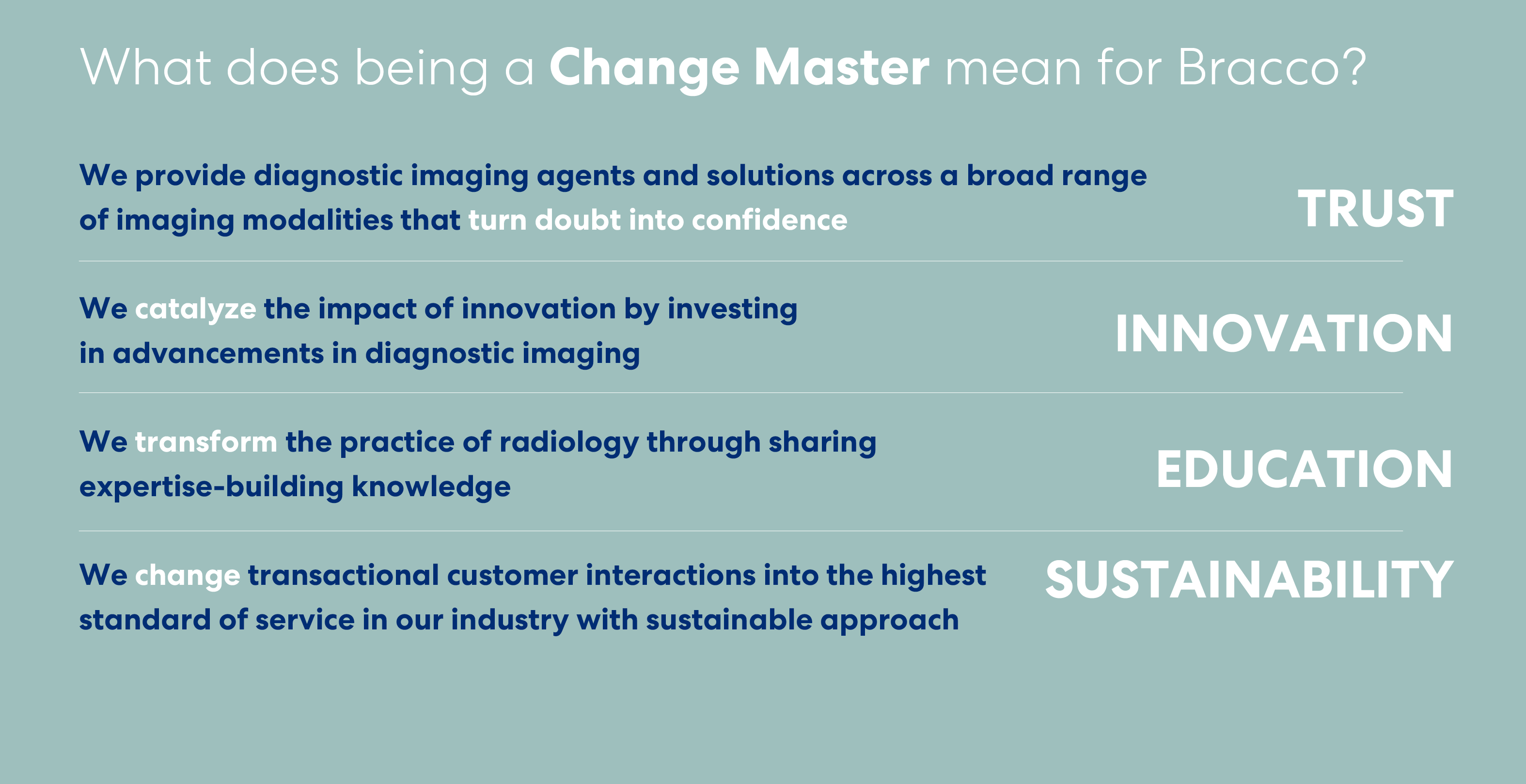
The archetype guides everything the company says and does, bringing clarity, consistency and harmony to the brand. It shapes Bracco’s decisions, actions and communications, fostering trust and deeper connections with stakeholders.

Personality, purpose, and perspective create the Corporate Brand Identity. Essentially, it is how the company present itself to the world and how it wants to be perceived.

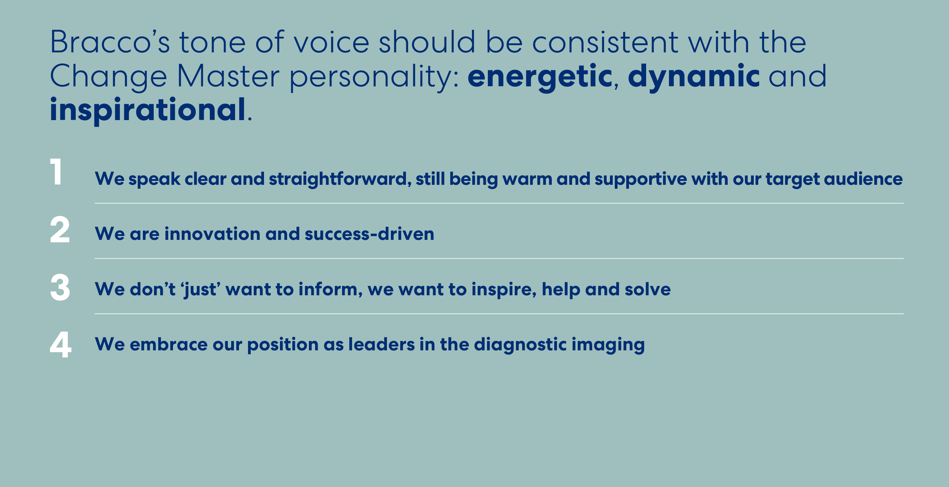
Tone of Voice

Tone of voice means the set of all the stylistic, linguistic, lexical and semantic elements through which Bracco communicates with its audience, showing something more than just words: its values, its essence, whatmakes the brand unique.

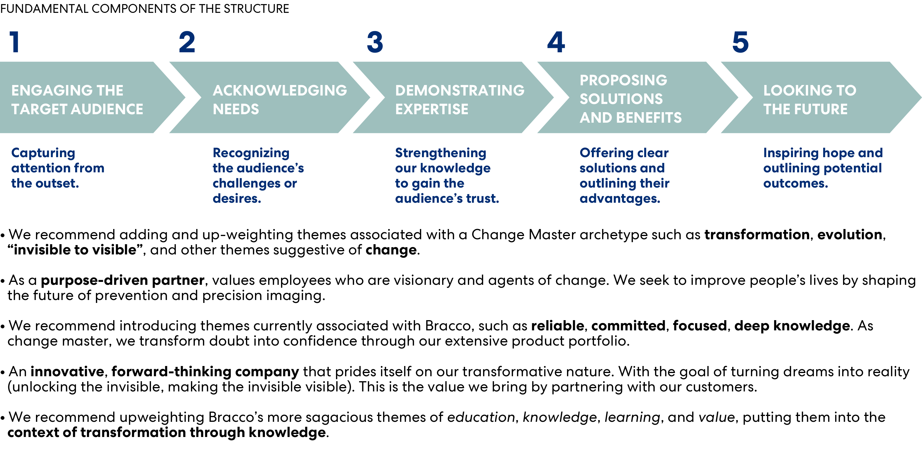
Narrative Structure

Whenever we share a story— be it an event, a speech, or a post—we should adhere to a general narrative structure, tailoring it to the specific context, audience, and content.

Brand Identity

The stripes are part of Bracco’s new visual identity and they originate from the concept “Unlocking the Invisible”.

They  represent the helpers and highlighters, making the invisible visible (illuminating it) and driving innovation and progress.

They perfectly embody Bracco’s business, especially with its contrast agents.


Graphic Elements

The Bracco trademark has been specially designed as a unit and must not be changed. Reproductions of this trademark must always be made from master digital files. Consistent application of the trademark reinforces the Bracco brand.
The complete Bracco logo must always be reproduced legibly.
Whilst there are no maximum dimensions for the Bracco logo, be aware of the minimum dimensions. Our logo can help establish brand recognition, build trust, and differentiate the company from its competitors. The logo should be visually striking, versatile, and scalable across various mediums to ensure consistency in the brand’s messaging and visual identity.

Minimum digital size:
100px, without tagline

On coloured background

The logo may be used full colour or white in order to have the maximum contrast. Generally speaking, over a 40% intensity background the logo and tagline must be negative (white).

The logo and tagline must be in the positive versions (full colour or black) on a background of up to 40% intensity.

On backgrounds with color tints up to
30-40%, we use the logo in its original colours. For darker or more intense backgrounds, the logo should be used in its negative version (white).

The Stripes

We use the two parallel stripes from the Bracco logo as an additional graphic element that dynamically adapts and evolves across different platforms, media, and experiences.

The stripes are derived from a portion of the logo but have been shortened to improve the aspect ratio. They can be integrated into layouts as small details to add a touch of corporate color or used in larger formats as shapes to frame images.

Allowed colours

The stripes serve as a distinctive element, imparting a personalized touch to layouts within both corporate and product contexts. Optimal color choice for corporate applications is the blue and green version. In instances of negative usage or when used in modalities colors, it is imperative that the stripes maintain consistent coloration.

The strategic use of modalities colors not only enhances visual appeal but also ensures a seamless and cohesive representation of the diverse range of products associated with our brand.

Corporate

PANTONE 288
RGB: 0-45-114
CMYK: 100-84-33-18
HEX: #002D72

PANTONE 347
RGB: 0-142-79
CMYK: 100-0-80-10
HEX: #008E4F

Corporate (Negative)

PANTONE 288
RGB: 0-45-114
CMYK: 100-84-33-18
HEX: #002D72

PANTONE 347
RGB: 0-142-79
CMYK: 100-0-80-10
HEX: #008E4F

Typography

Primary font

Montserrat is the official primary font for all Bracco communications.
As an open-source Google font, it is available without licensing constraints, ensuring accessibility and consistency across all regions and functions.

Montserrat must be used for all new materials, including presentations, documents, and digital content. Its versatility and readability make it suitable for both headlines and body text, supporting a clear and modern visual identity across all applications.

Montserrat

Montserrat —
Light

Aa Bb Cc Dd Ee Ff Gg Hh Ii Jj Kk Ll Mm Nn Oo Pp Qq Rr Ss Tt Uu Vv Ww Xx Yy Zz
0123456789
!"$%=()|[]:+?;

Montserrat —
Roman

Aa Bb Cc Dd Ee Ff Gg Hh Ii Jj Kk Ll Mm Nn Oo Pp Qq Rr Ss Tt Uu Vv Ww Xx Yy Zz
0123456789
!"$%=()|[]:+?;

Montserrat —
Bold

Aa Bb Cc Dd Ee Ff Gg Hh Ii Jj Kk Ll Mm Nn Oo Pp Qq Rr Ss Tt Uu Vv Ww Xx Yy Zz
0123456789
!"$%=()|[]:+?;

Montserrat —
Light

Aa Bb Cc Dd Ee Ff Gg Hh Ii Jj Kk Ll Mm Nn Oo Pp Qq Rr Ss Tt Uu Vv Ww Xx Yy Zz
0123456789
!"$%=()|[]:+?;

Montserrat —
Roman

Aa Bb Cc Dd Ee Ff Gg Hh Ii Jj Kk Ll Mm Nn Oo Pp Qq Rr Ss Tt Uu Vv Ww Xx Yy Zz
0123456789
!"$%=()|[]:+?;

Montserrat —
Bold

Aa Bb Cc Dd Ee Ff Gg Hh Ii Jj Kk Ll Mm Nn Oo Pp Qq Rr Ss Tt Uu Vv Ww Xx Yy Zz
0123456789
!"$%=()|[]:+?;

Preferred body copy colors

CMYK 0-0-0-100

CMYK 100-84-33-18

CMYK 0-0-0-00

CMYK 0-0-0-85

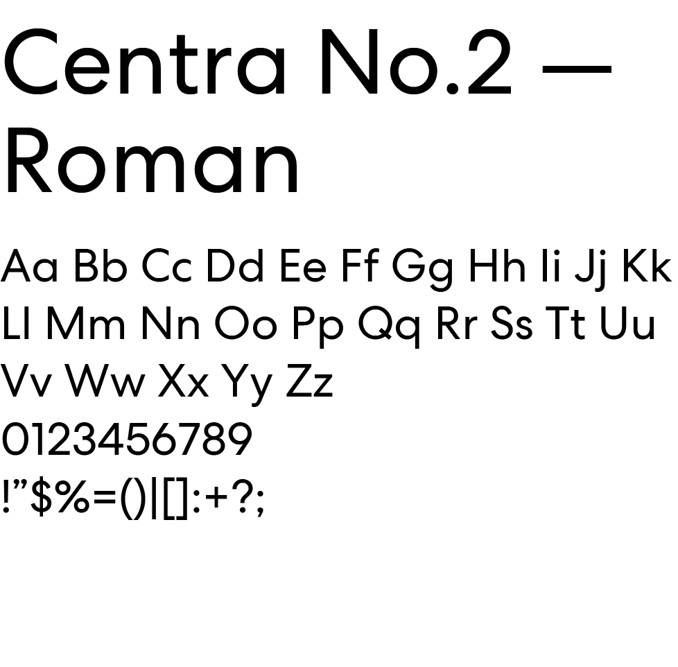
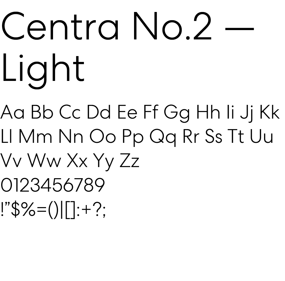
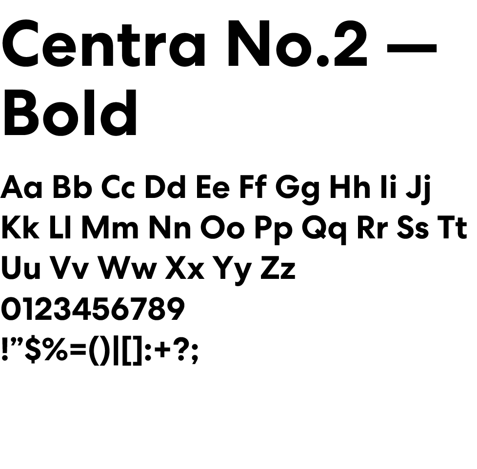
Legacy font

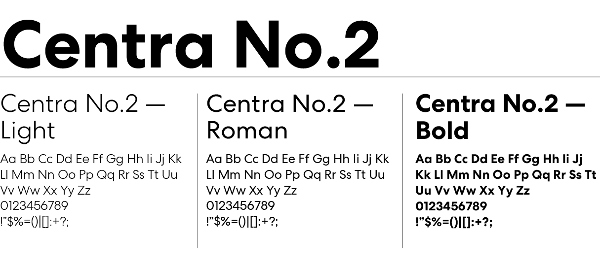
Centra No.2 is a premium typeface that requires a specific license for use.

While it was previously adopted as the primary font, it is now maintained only for existing materials where already applied (e.g. printed assets and legacy templates). These materials do not require immediate updates.

Centra No.2 will be progressively phased out and replaced by Montserrat to ensure a more scalable and consistent use of typography across the organization.

Preferred body copy colors

CMYK 0-0-0-100

CMYK 100-84-33-18

CMYK 0-0-0-00

CMYK 0-0-0-85

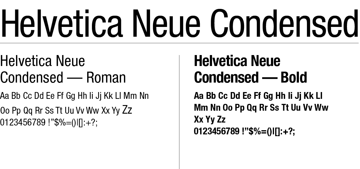
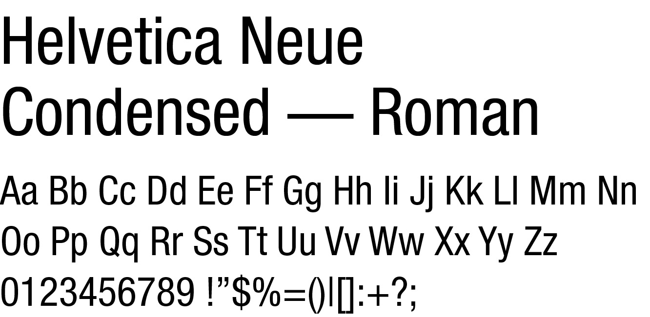
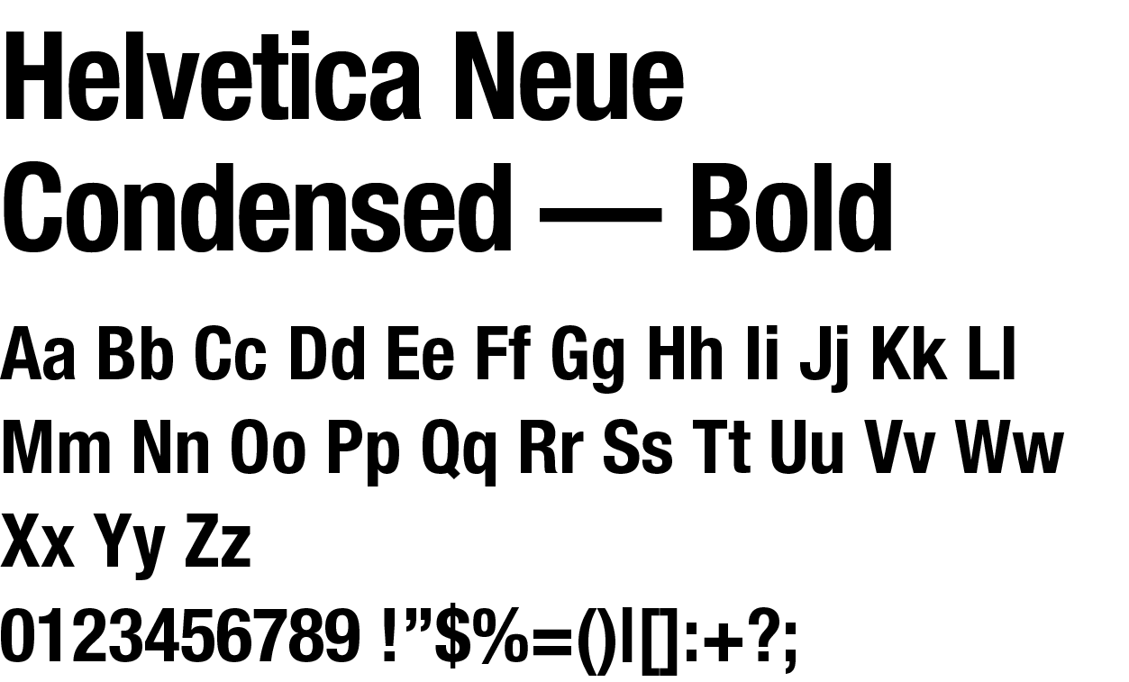
Technical font

Helvetica, particularly its condensed versions, will be reserved for technical aspects such as SPCs (Summary of Product Characteristics) or package inserts, where long texts need to be presented clearly within limited space. Its compact design allows for efficient use of space while maintaining legibility.

Preferred body copy colors

CMYK 0-0-0-100

CMYK 100-84-33-18

CMYK 0-0-0-00

CMYK 0-0-0-85

Basic layout

Typography – the process of choosing and applying a typeface and font – is an important element in expressing and defining a brand.

When used correctly and consistently, it guarantees conciseness and brand recognition.

To ensure maximum clarity and consistency, layouts are made up of a bold headline, descriptive bold sublines and light copy texts that complete the overall typographical picture. The bold font contrasts with the light font to create a modern and clean feel. Only defined typefaces must be used.

Basic rules:

In the world of typography, the strategic use of white space is a design essential. Remember, white space isn’t wasted space – it’s a valuable design element that elevates and overall visual appeal.

  • Improve Readability
  • Enhance Focus
  • Create a Balanced Layout
  • Use Consistent Margins
  • Convey Simplicity

Corporate Colours

Primary colours

We would like to keep the colour use simple and consistent. The brand identity will be stronger and more unique to Bracco when using the brand colours as the main choice, supported by black (mainly for type) and a range of greys (for backgrounds).

Keep Bracco Blue and Bracco Green as the most prominent colours.

PANTONE 288
RGB: 0-45-114
CMYK: 100-84-33-18
HEX: #002D72

SHADE
50%

SHADE
10%

PANTONE 347
RGB: 0-142-79
CMYK: 100-0-80-10
HEX: #008E4F

SHADE
50%

SHADE
10%

PANTONE
Cool Grey 2
RGB: 210-208-205
CMYK: 21-15-19-1
HEX: #CECECC

PANTONE
Cool Grey 4
RGB: 189-187-187
CMYK: 29-23-23-3
HEX: #B9B9B9

PANTONE
Cool Grey 6
RGB: 169-168-169
CMYK: 36-28-29-7
HEX: #A6A6A8

PANTONE
Cool Grey 9
RGB: 119-119-122
CMYK: 52-42-39-23
HEX: #757679

WHITE

BLACK

Modality palette

We picked these additional colors from the established modality colors. They are useful in adding diversity to the palette.

Charts and graphs are good examples of usage of secondary colours.

PANTONE 288
RGB: 0-45-114
CMYK: 100-84-33-18
HEX: #002D72

CT

PANTONE 347
RGB: 0-142-79
CMYK: 100-0-80-10
HEX: #008E4F

CEUS

PANTONE Process Blue
RGB: 0-133-202
CMYK: 100-28-6-0
HEX: #0085CA

MRI

PANTONE 2705
RGB: 165-163-209
CMYK: 35-33-0-0
HEX: #A3A3E0

MOLECULAR IMAGING

PANTONE 8263
RGB: 55-128-130
CMYK: 59-2-0-49
HEX: #358082

CARDIOVASCULAR

PANTONE 1375
RGB: 242-156-4
CMYK: 2-45-97-0
HEX: #F19B04

DI INJECTORS

PANTONE 347
RGB: 0-142-79
CMYK: 100-0-80-10
HEX: #008E4F

PANTONE Process Blue
RGB: 0-133-202
CMYK: 100-28-6-0
HEX: #0085CA

DIGITAL HEALTH

Gradient

This gradient is useful for adding diversity to the palette and can be layered over images to adjust their colour.

PANTONE 347
RGB: 0-142-79
CMYK: 100-0-80-10
HEX: #008E4F

PANTONE 288
RGB: 0-45-114
CMYK: 100-84-33-18
HEX: #002D72

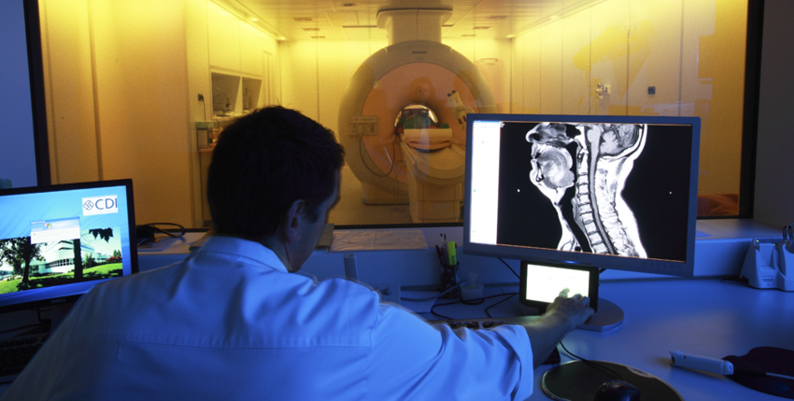
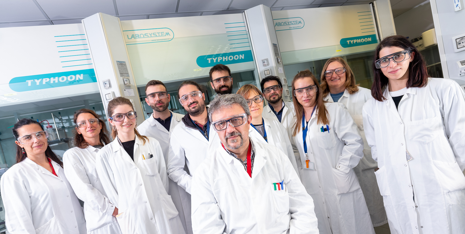
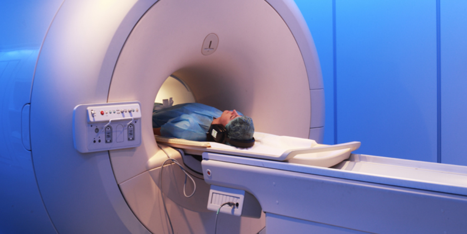
We are using imagery with a humane perspective and we focus on people. Warmth, empathy, solicitude and a real world look & feel is very important if you want to engage your target audiences.

  • 1

    Relationship - and team working-oriented
  • 2

    Human and technical - focused on people
  • 3

    Authentic, highly aesthetic and positive
  • 4

    High-quality, universal and focused
  • 5

    Documentary-style character
  • 6

    Concise, consistent, and homogeneous

Patients and Doctors

In the images capturing the essence of patient care and collaboration with healthcare professionals, Bracco shines a spotlight on the human side of our mission. These visuals portray the connection between patients and doctors, reflecting the heart of our commitment to enhancing healthcare experiences. They convey the trust, empathy, and expertise that define the collaborative journey towards better health. Each image embodies the shared dedication of our team and the healthcare community to ensure every patient receives the utmost care and support.

Sustainability

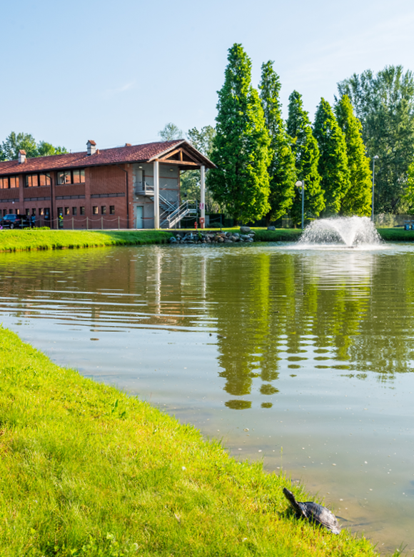
In every image portraying sustainability at Bracco, witness our team’s genuine dedication to environmental responsibility. These visuals encapsulate our commitment to sustainable practices and community engagement, showcasing a collective journey toward a greener future. Together, we’re making a positive impact on both health and the world we inhabit.

People

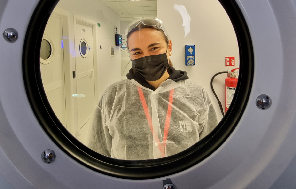
The images that speak of Bracco must start from the reality of the company: a reality made up of real individuals, strongly involved in the activities endorsing the quality and effectiveness of our products and services. These images represent people that work together with the same mission.

Innovation

Innovation at Bracco is more than just a concept; it’s a driving force propelling us toward excellence. Our images showcasing innovation capture the dynamic synergy among our talented individuals dedicated to pushing boundaries and advancing healthcare solutions. The visuals should  reflect our commitment to pioneering technologies and groundbreaking ideas, illustrating a collective mission to redefine possibilities and elevate the standards in diagnostic imaging.

Education

Our curated images capture the essence of learning and collaboration. If you need to publish live event images, ensure they meet resolution standards, are properly edited maintaining a polished and professional look, and receive approval from the involved organizations.

How To

Welcome to the Bracco Brand Guidelines Learning Hub!

In this section, you’ll find a series of concise, practical how-to videos designed to help you make the most of Bracco’s brand guidelines. Whether you’re working on presentations, digital content, or print materials, these micro-tutorials will guide you step-by-step through essential branding practices to ensure consistency and excellence.

Elevating Bracco’s Brand

Carolina Bargoni presents the New Guidelines

Brand Guidelines

How to use these Brand Guidelines Manual

The Bracco Logo

How to download the correct versions and the appropriate contexts for usage

The Stripes

Demonstrate how to correctly use the stripes

Typography

Which fonts to use and for which applications (print, web, etc.)

E-mail Signature

How to request your email signature

LinkedIn Profile Cover

How to use download and use the personal profile cover

PowerPoint Template

How to use the right template in your presentations

Teams Background

How to use and set your Teams background


Toolkit Downloads

Graphic Elements

Applications

If you need to edit any part of the Corporate Presentation please contact the Global Branding Communication Team

Bracco Copyright © 2024 | Registered office: Via E. Folli, 50, 20134 Milano, Italy | Share Capital € 104.000.000 f.p. | VAT Milan Comp. Reg. n. 00825120157 | Milan REA n. 348182